Basic tutorial for creating scatterplots in MS Excel
Open Microsoft Excel and choose Blank workbook.
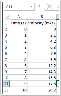
Place your data into a table.
Place your x-data in the left-hand column, and your y-data in the right-hand column. Add column labels with units, but do NOT put units beside your numerical values.
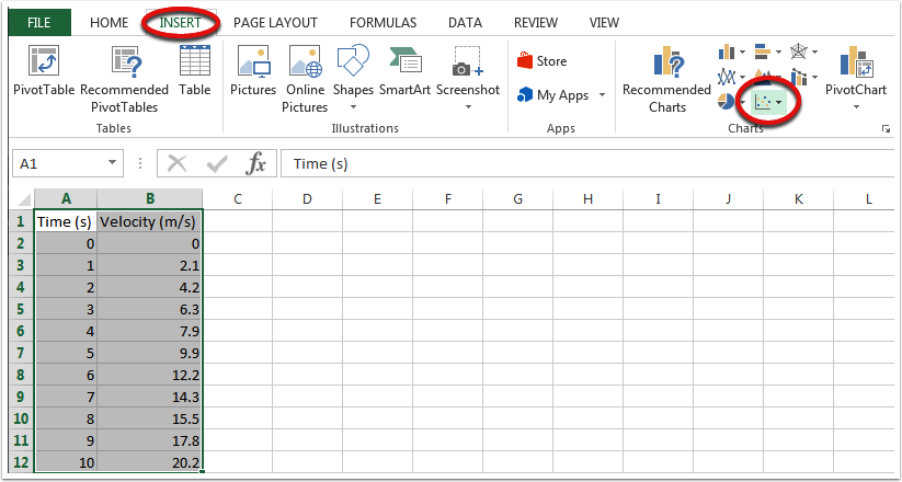
Highlight the data you want to graph, choose the Insert tab at the top of the screen, then choose the scatterplot symbol from the Charts section.
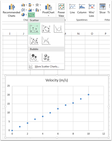
Choose the upper-left version of the scatter plot and you should see your chart appear.
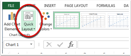
Choose Quick Layout and select a chart format to add your axis labels.
The upper-left option is usually a good bet.
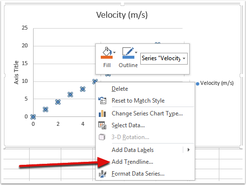
Right click on one of your data points and choose "Add Trendline" to have Excel attempt to fit your data.
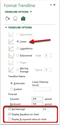
Choose the type of fit you want from the Trendline Options menu.
Typically you will want a linear fit, but Excel can attempt other fits.
Pay special attention to the three options at the bottom of the screen. If you are certain that 0,0 is a data point for your graph, you can force Excel to include that in its model by selecting "Set Intercept" and making sure it is zero. To add the equation of the line to your chart (helpful in determining the slope and y-intercept), choose "Display Equation on chart." Finally, if you want to know how well Excel was able to fit your data, you can show the R-squared value on your chart by choosing the final option. R-squared values close to 1 indicate very good fits. R-squared values close to 0 indicate extremely poor fits.